
How Primary Colours Affect Our Consumption Habits
How Primary Colours Affect Our Consumption Habits
You may not realize it on a day-to-day basis but the colours that you see can impact your mood and the choices you make. This is especially important for marketers and advertisers to keep in mind when devising billboard, magazine & television ads, plus the logos for their own company.
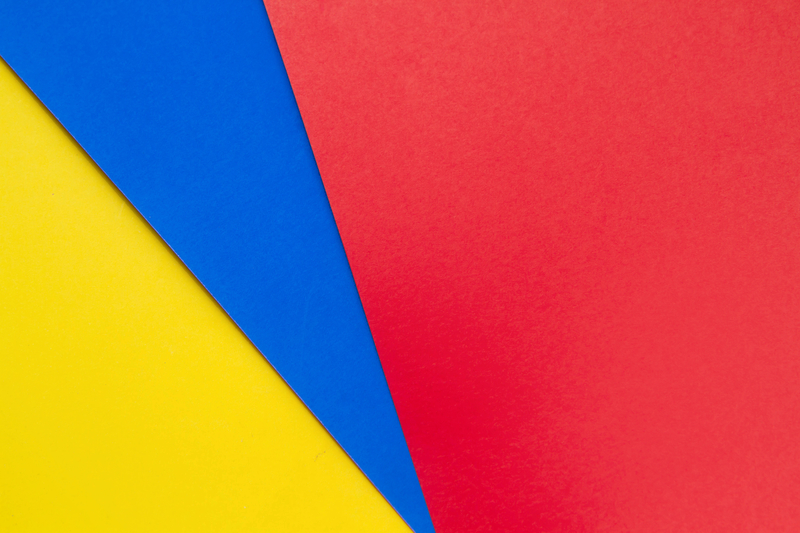
Subconsciously, we gravitate towards colours that align themselves with our current mindsets and moods. Here are a few differences between the primary colours that marketers use to capture consumer attention:
Subconsciously, we gravitate towards colours that align themselves with our current mindsets and moods. Here are a few differences between the primary colours that marketers use to capture consumer attention:
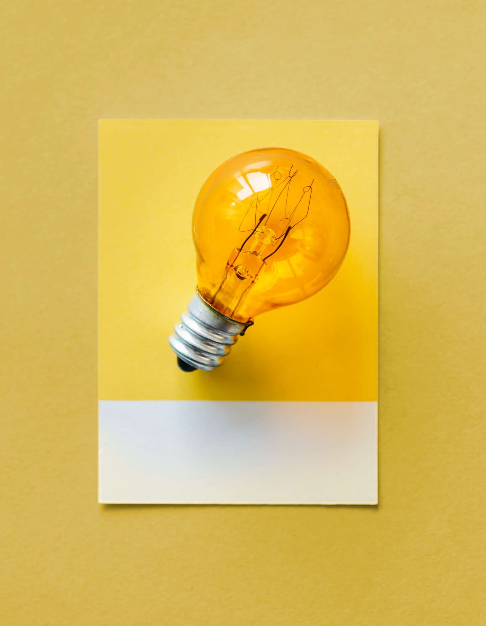
YELLOW
Yellow is the colour of positivity, joy, and enthusiasm. Yellow stands out amongst an array of different colours due to its vibrancy. You won’t often see yellow used as the sole colour in an advertisement because too much of it can evoke feelings of anxiety and concern since it's hard to see on its own.
However, because it stands out compared to duller colours, it works perfectly for marketers that wish to invoke an appetite in consumers & encourages consumers to act on an impulse buy. Fast food restaurants commonly use yellow to excite consumers; yellow quickly grabs a consumer’s attention, connects to their feelings of happiness and relies on them to engage in an impulse buy (i.e. McDonald's, Burger King, Subway, etc.). Taxi cabs also use yellow as the primary colour for their vehicles because they are easier to spot than a red or blue cab would be.
RED
Red is a colour that is associated with power, authority and urgency. While it lacks the vibrancy of colour like yellow, it is more versatile and connects itself with humanistic qualities (love, energy, passion, etc.). Red excites the human body; it triggers our desire for food, it heightens our blood pressure and increases our heart rate. It is a colour that also symbolizes danger and caution which is why stop signs and stoplights use it, but that is not a knock on it.
Many e-commerce websites will use red to promote clearance sales or use red for “buy now” or “register now” buttons to ensure they catch the user’s attention. Red is the most dominant of the primary colours; the power that red commands is ingrained into the minds of consumers all over the world. It is no coincidence that some of the best-known logos in the world are red-dominant (i.e. Coca Cola, Netflix, YouTube and CNN).


BLUE
Blue is the colour of a clear sky and the giant, majestic ocean. Many of blue’s attributes connect us with nature, health, prosperity, wisdom and strength. Blue produces a calm and sombre tone, as it is often used in baby’s rooms, hospitals and wellness centre’s to de-stress and relax the human mind. Blue is often used by corporations that offer technological products/services (Facebook, Twitter, IBM, Intel) and cleaning/hygiene products (Dawn, Oral B, Gillette).
Although blue is the least recognizable primary colour for consumers, it is the most popular colour for men. Many products that are primarily designed for men use blue to increase the chances of attracting new male customers. Blue is seldom used by restaurants of any sort since blue typically suppresses one’s desire for food.